During the half term I am going to take 30 pictures and post it on this site and page for homework that I have to do. We brake up on this Friday 20th of October. We have to take pictures of thing that look nice. For this I have to use a phone camera so the quality of the picture won't be as good as the other picture on this site. I will only have 11 days to do this so I will have to go out a lot and take different and unique pictures.
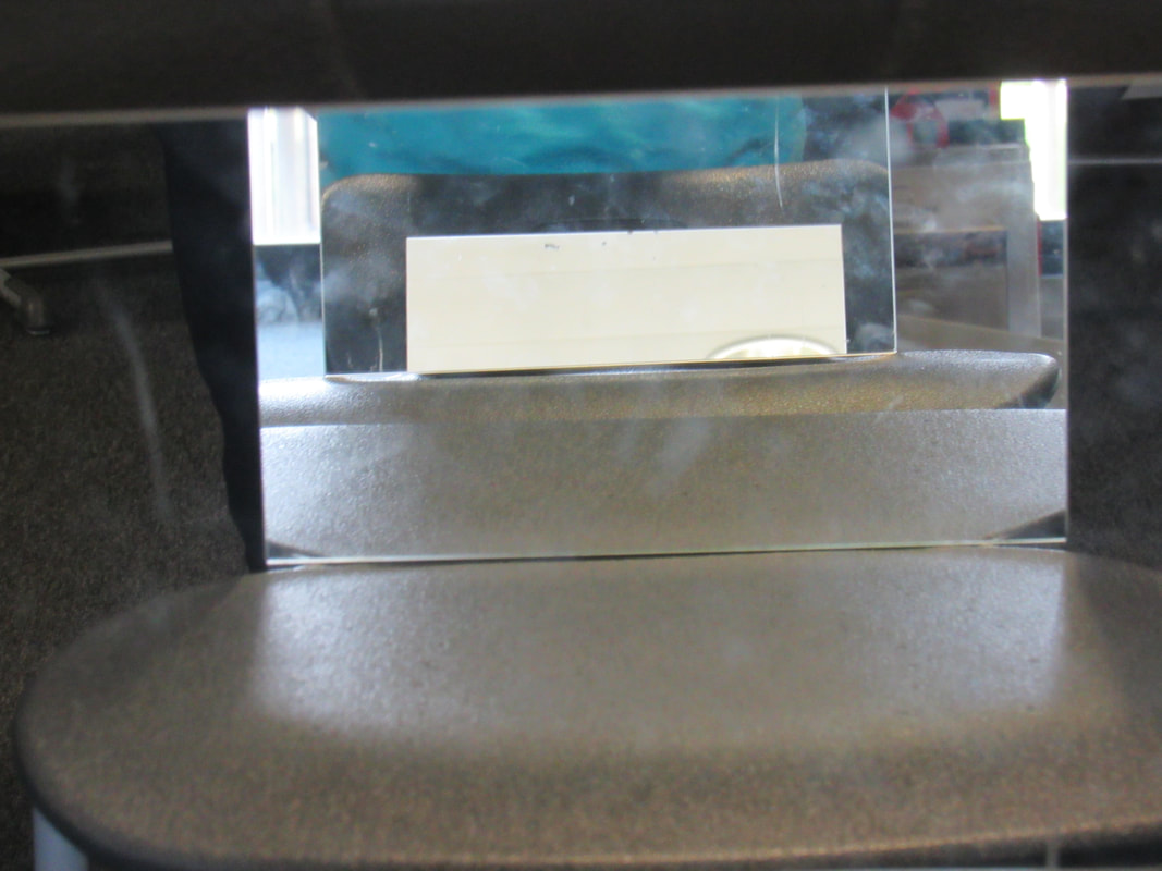
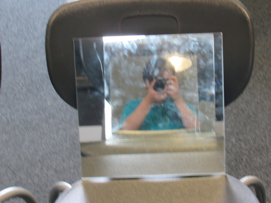
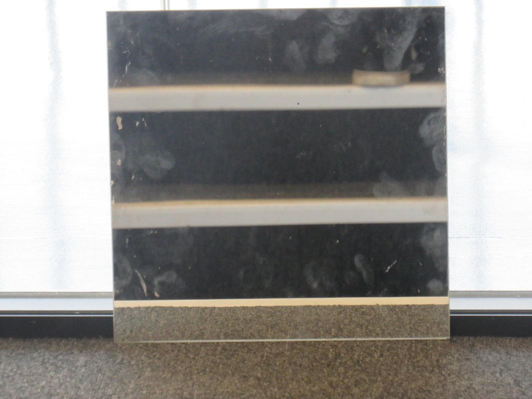
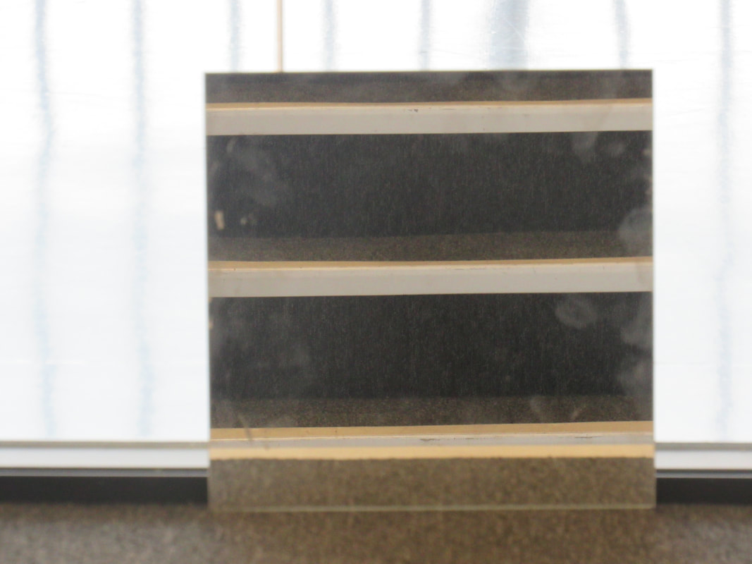
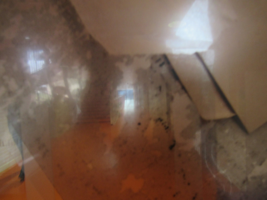
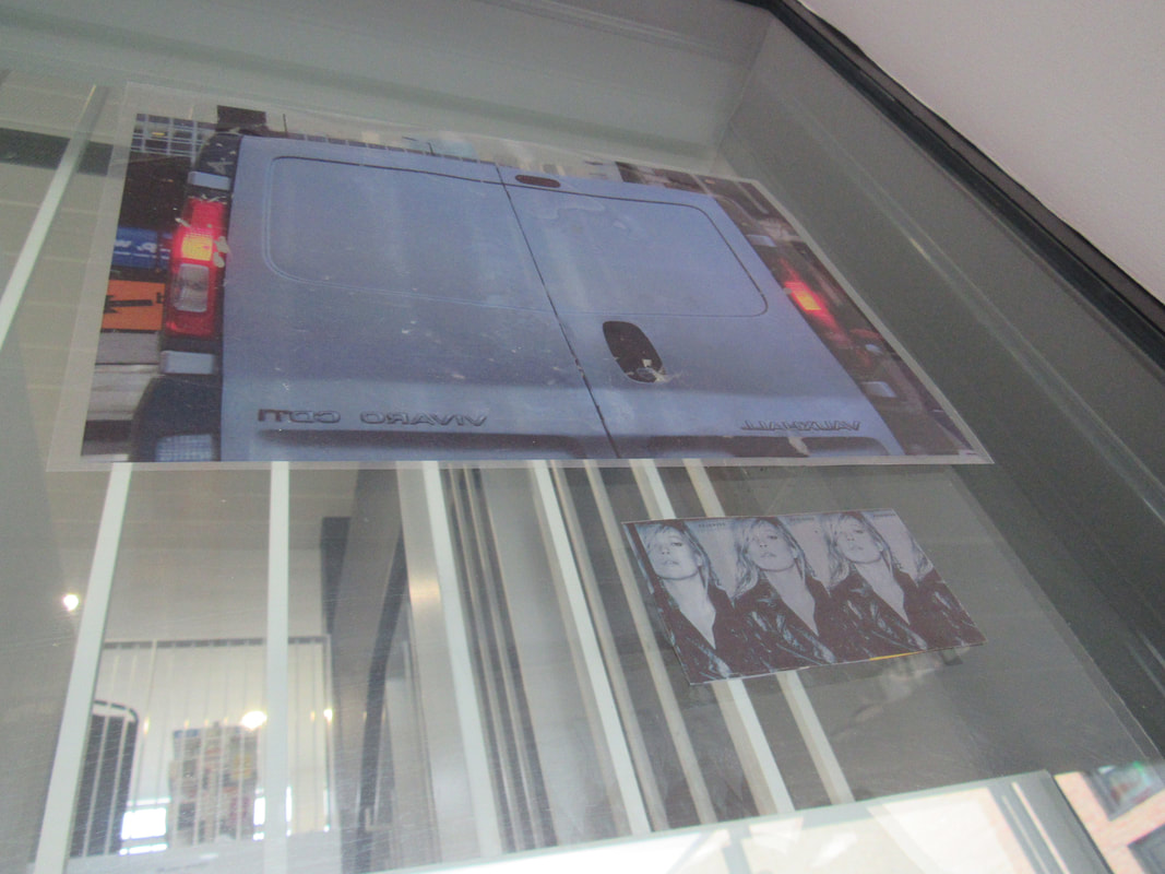
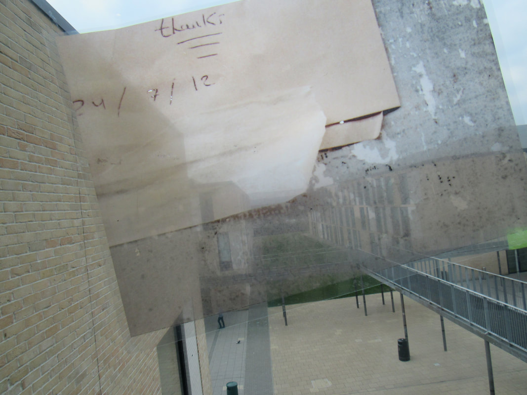
For todays lesson we used mirrors to make some edges
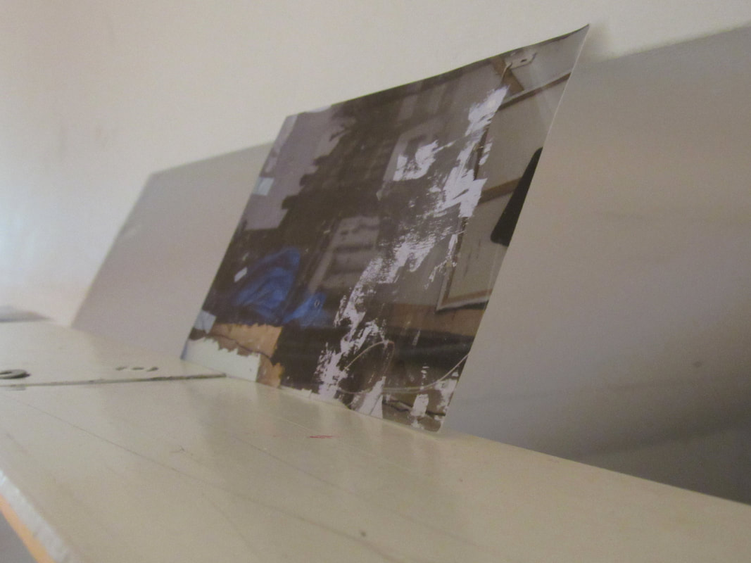
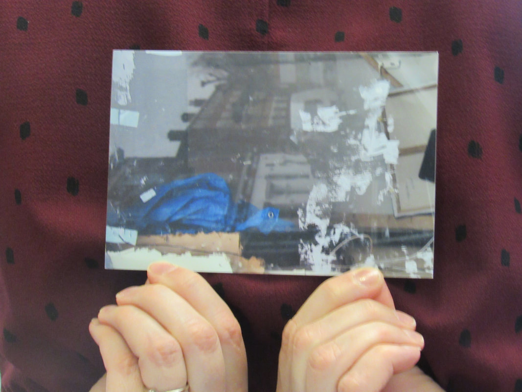
Here are some examples.
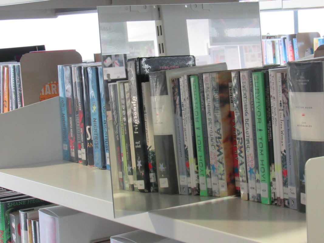
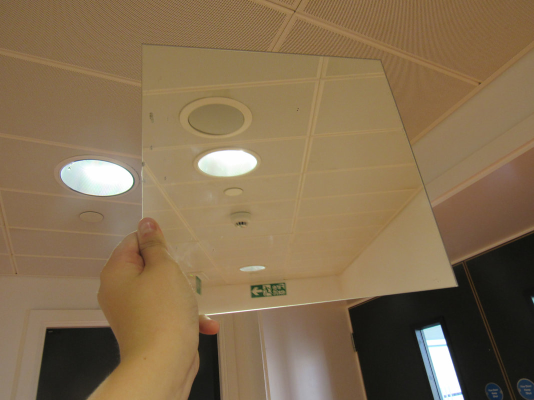
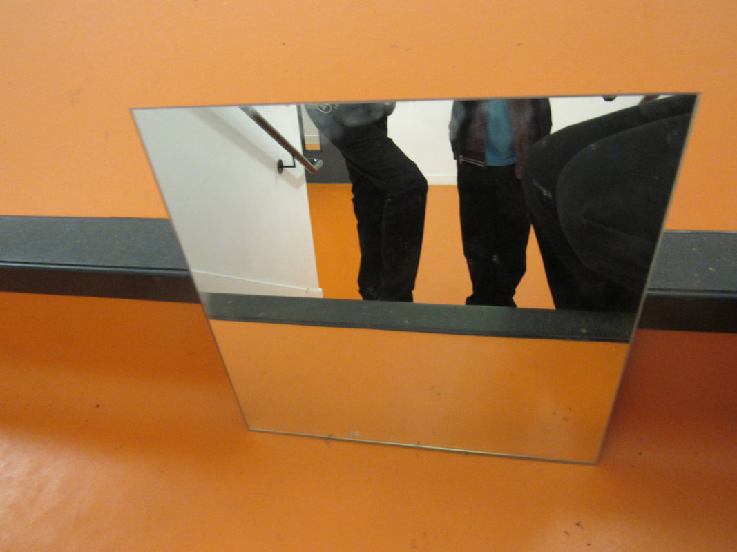
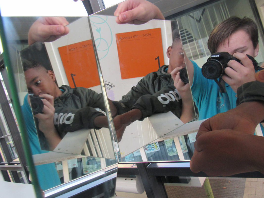
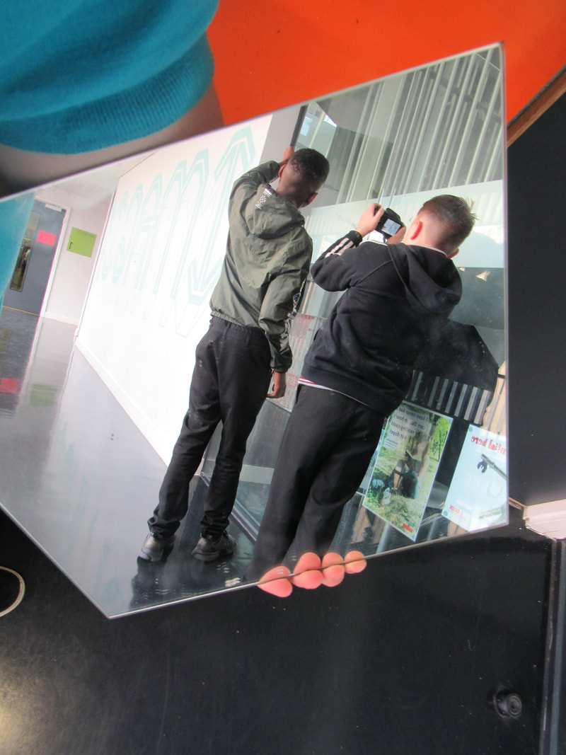
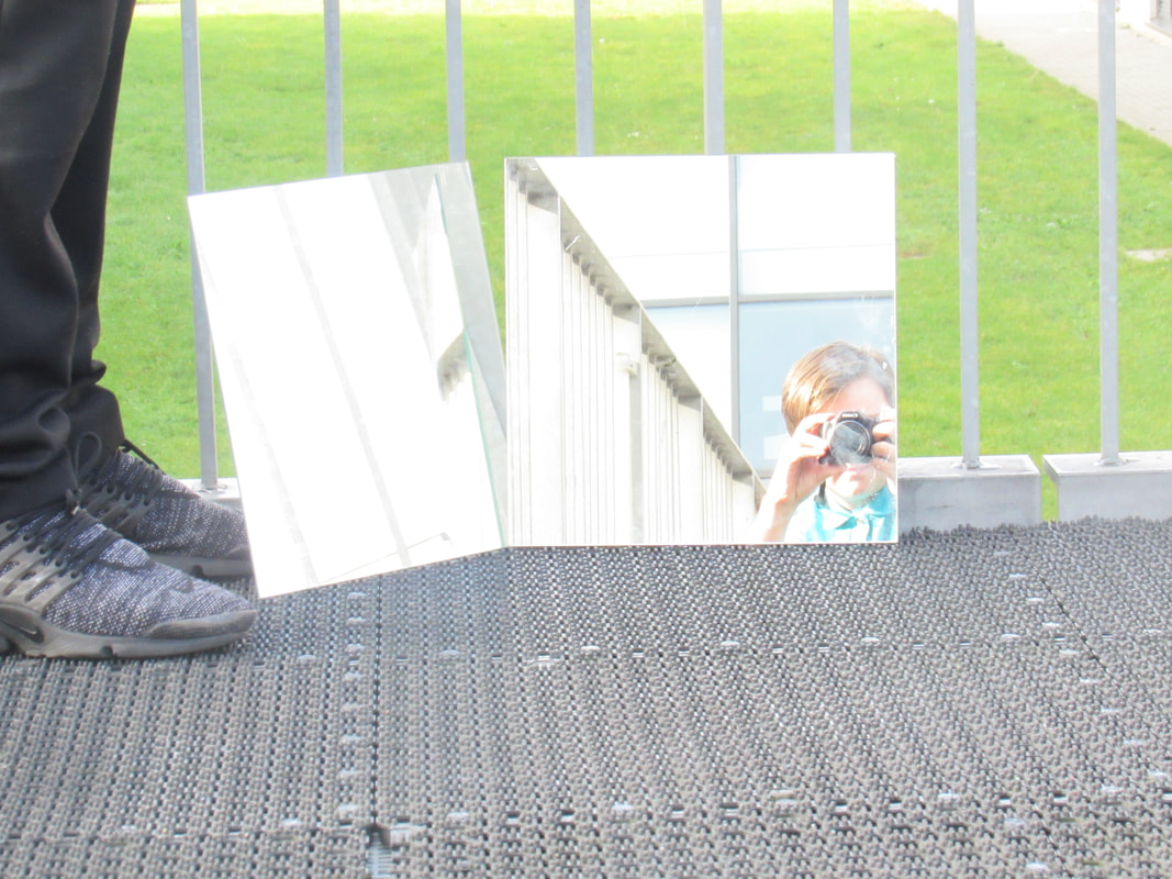
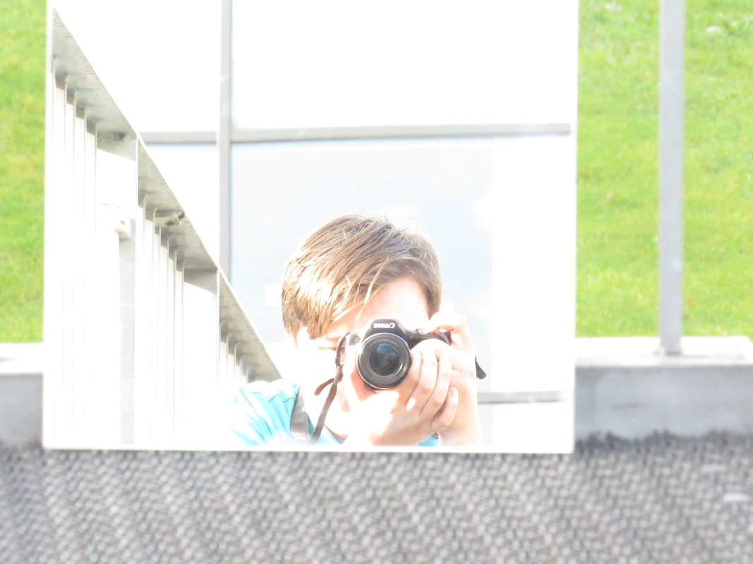
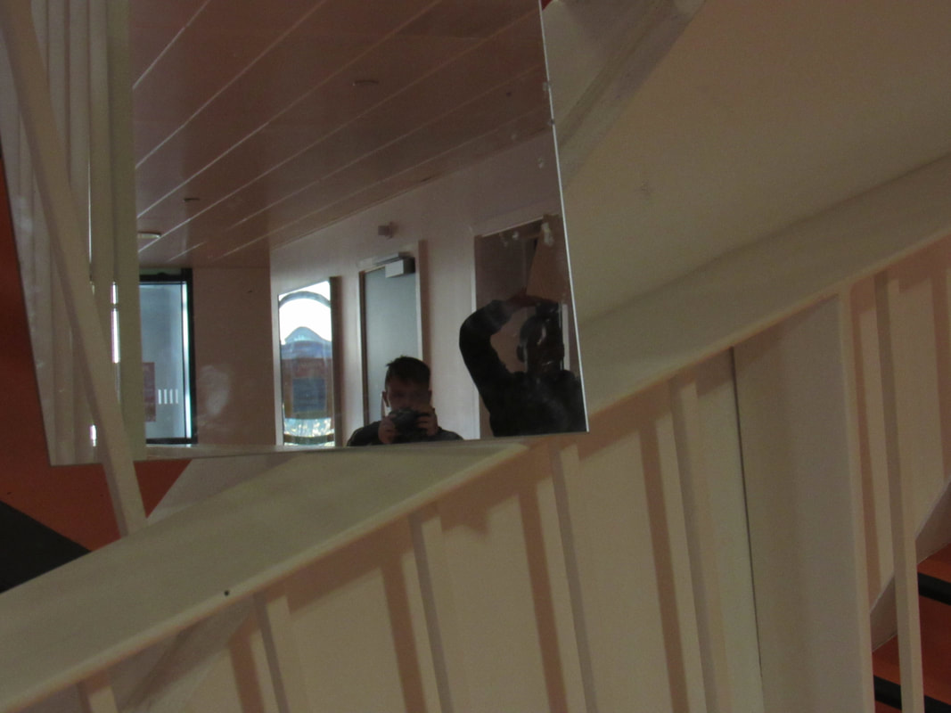
WWW: Some of them are very interesting.
EBI: If some pictures were less exposed to the light.
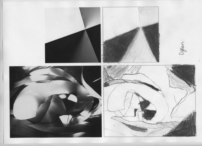
For the first 40 minutes of the lesson sir said that he have draw and we did the picture above is my drawings. My best one is the small one because the shadings. The bottom one was the hardest as I needed to concentrate much more and I would do things to far or to close and that made it harder than I already was.

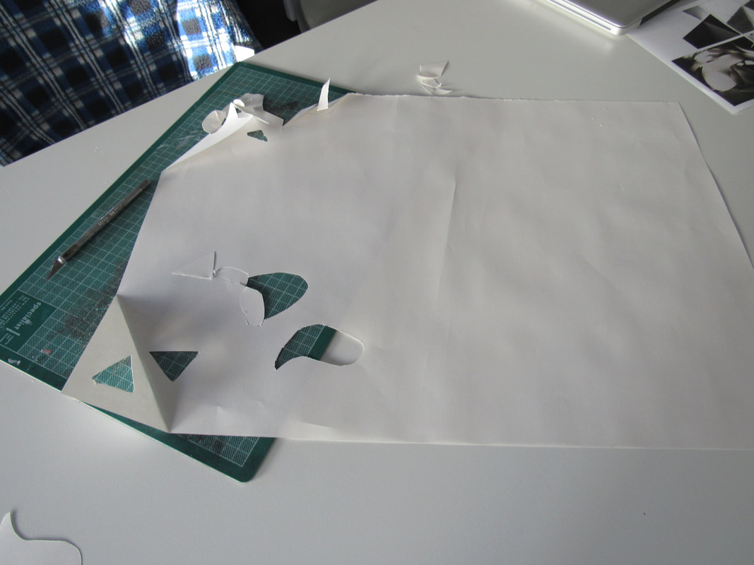
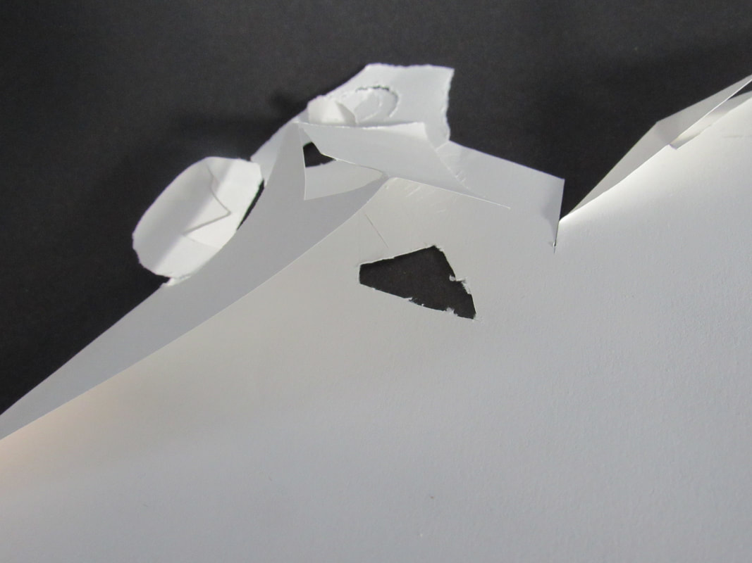
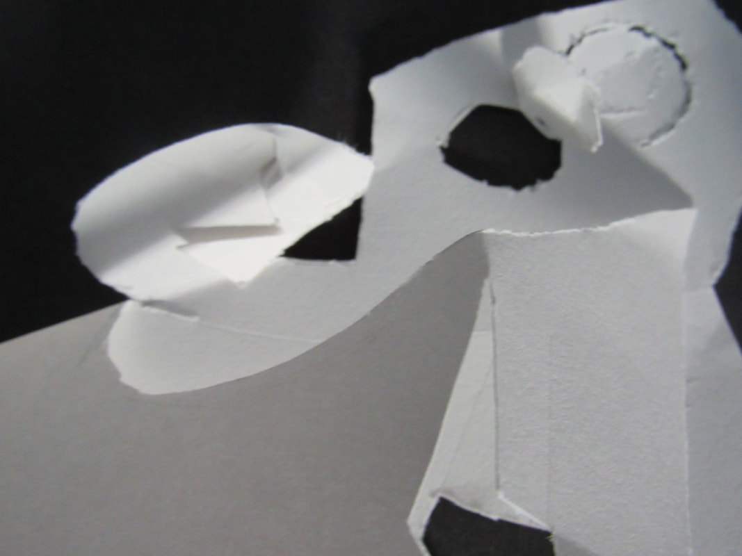
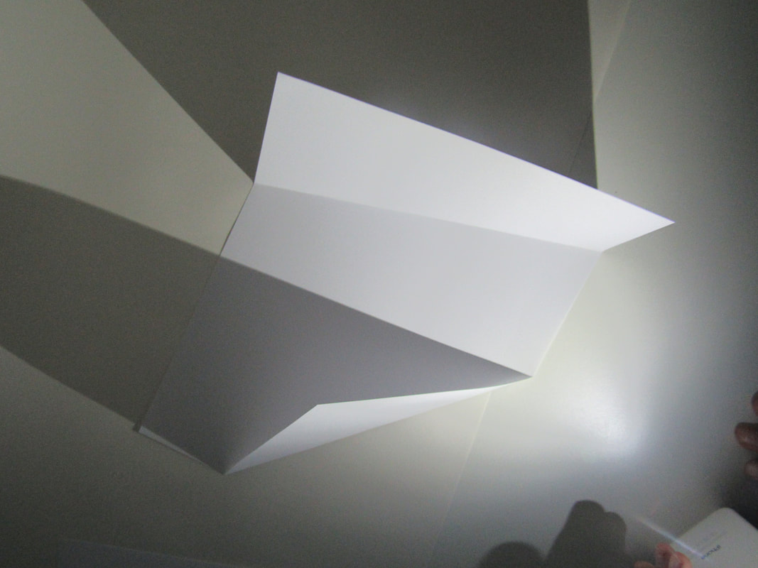
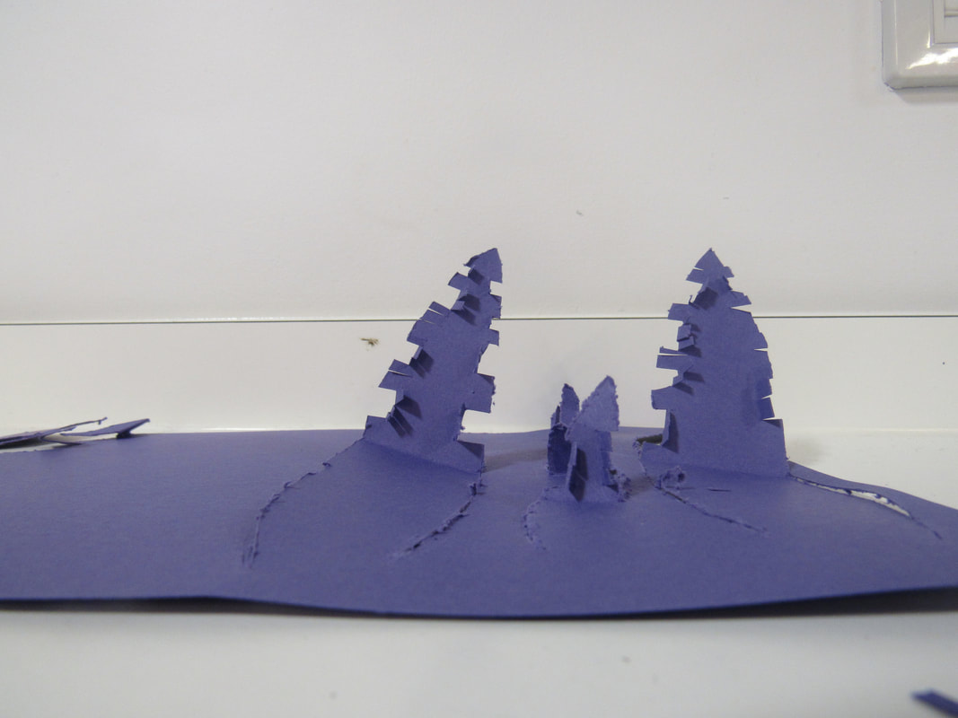
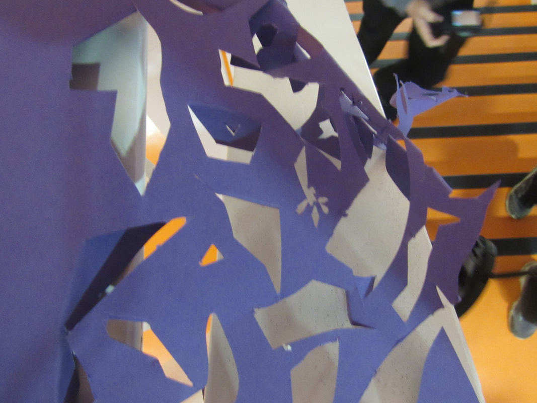
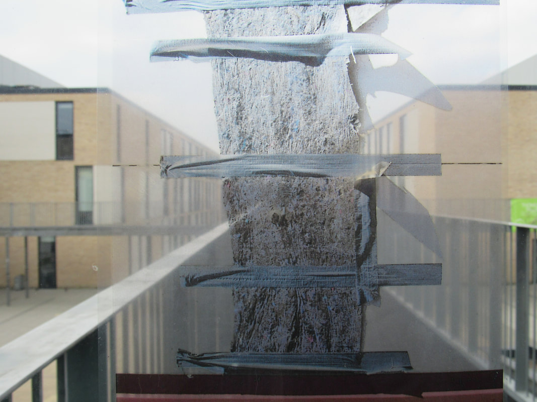
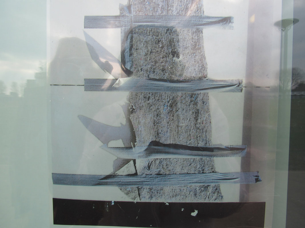
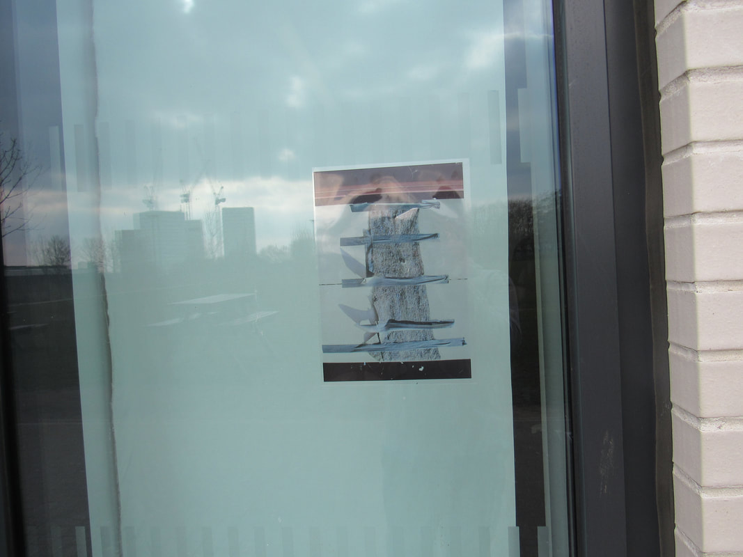
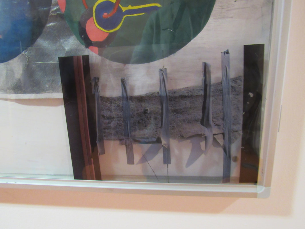
we have made a few pictures with just paper above is our latest one but it is just our making of our paper. Its a A3 paper so its gonna take a while.
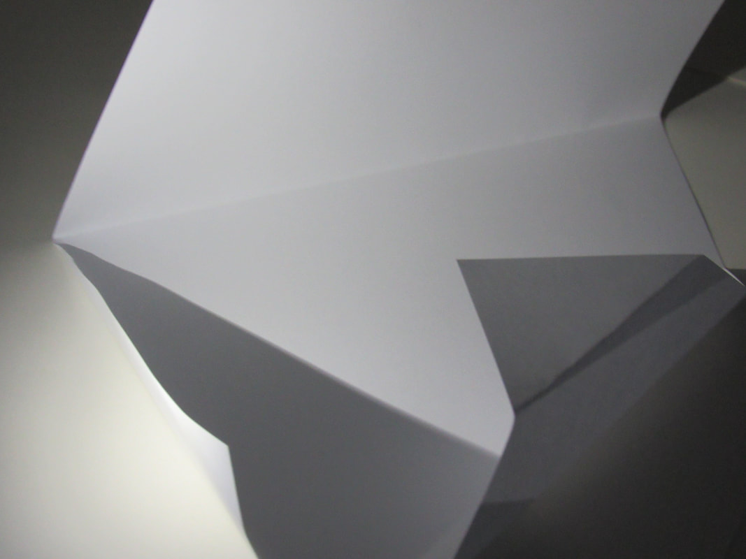
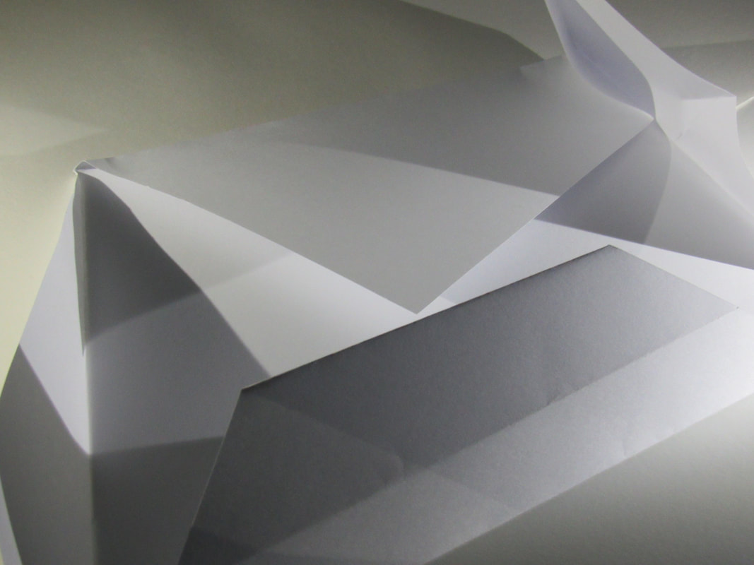
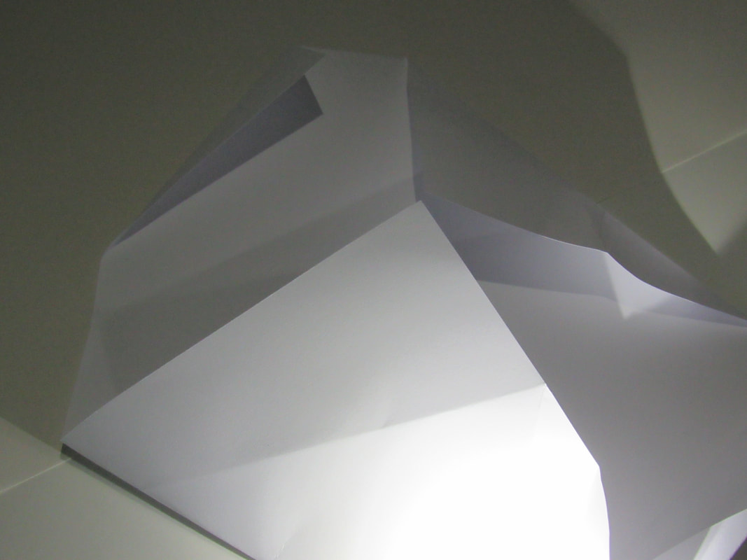
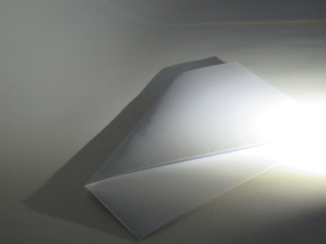
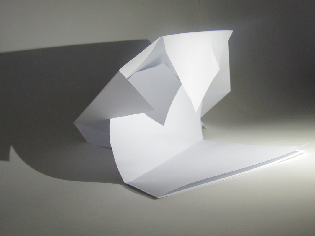
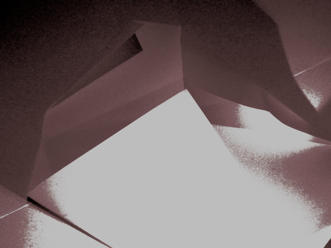
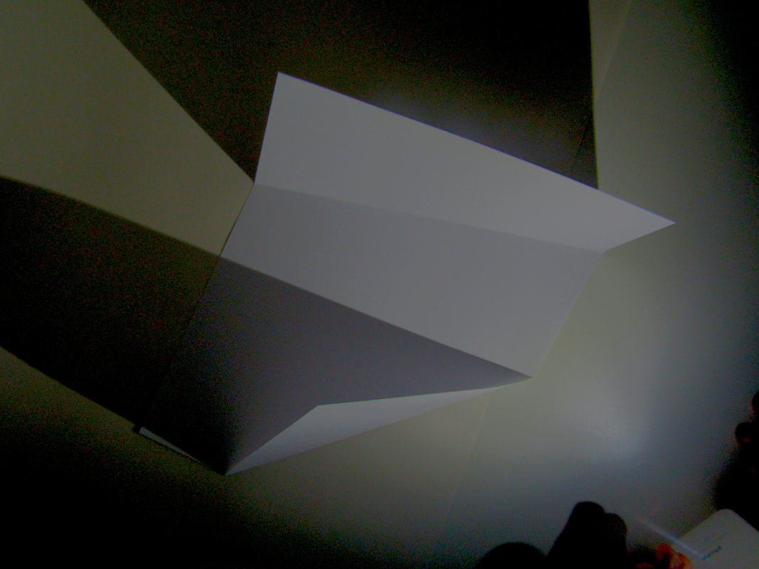
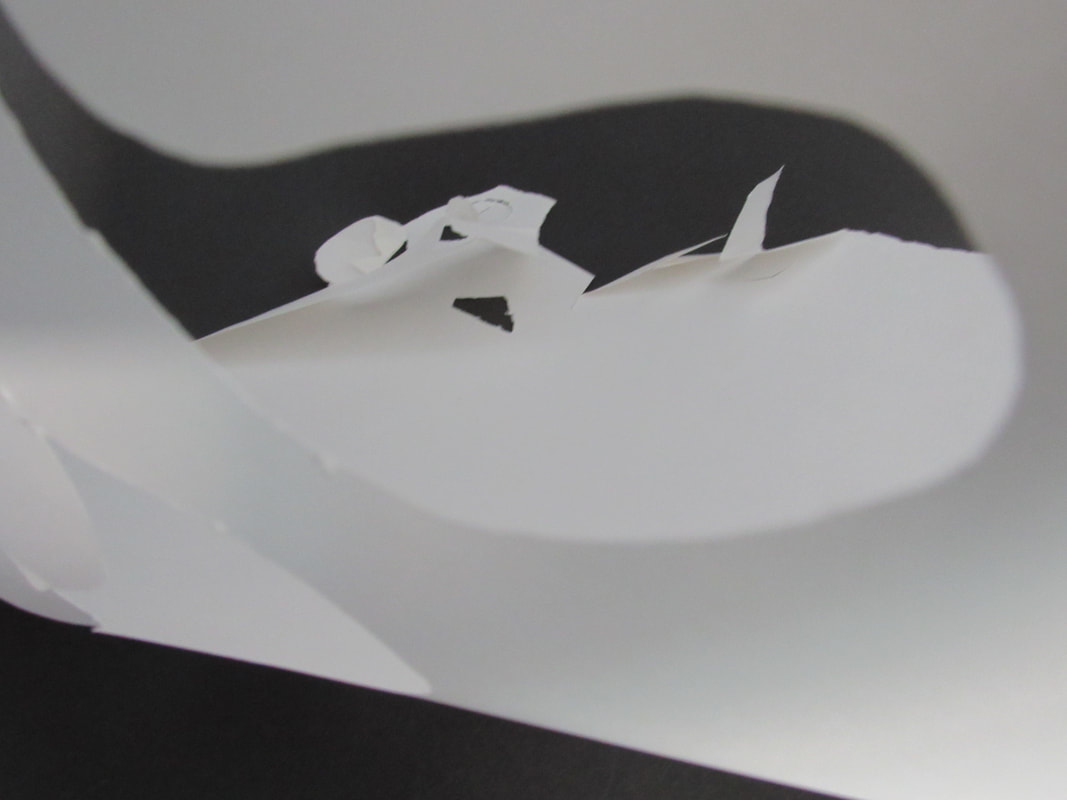
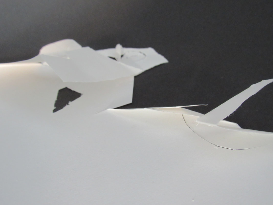
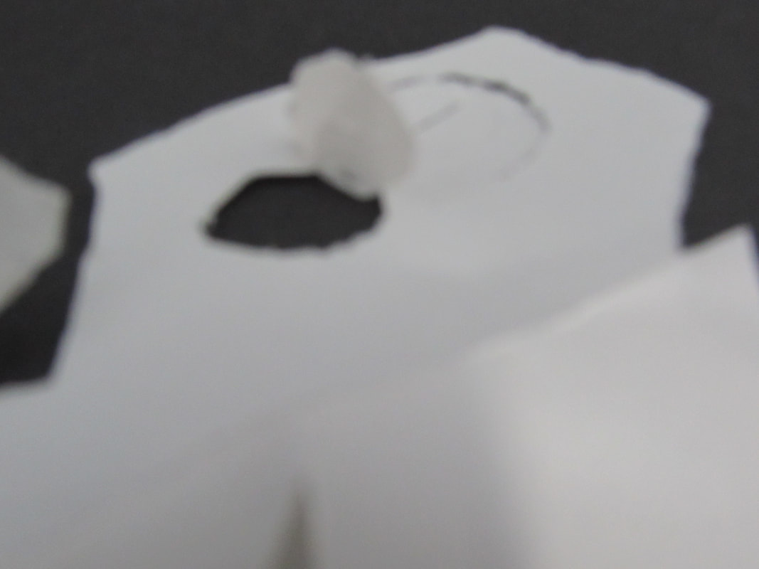
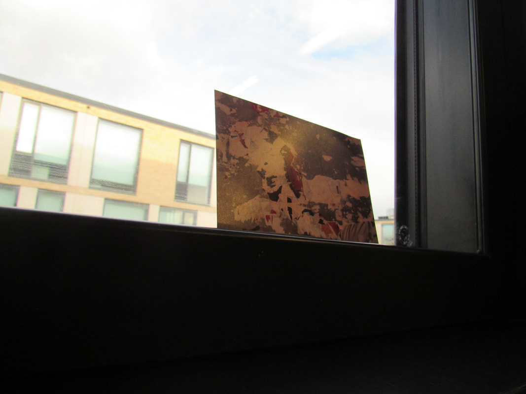
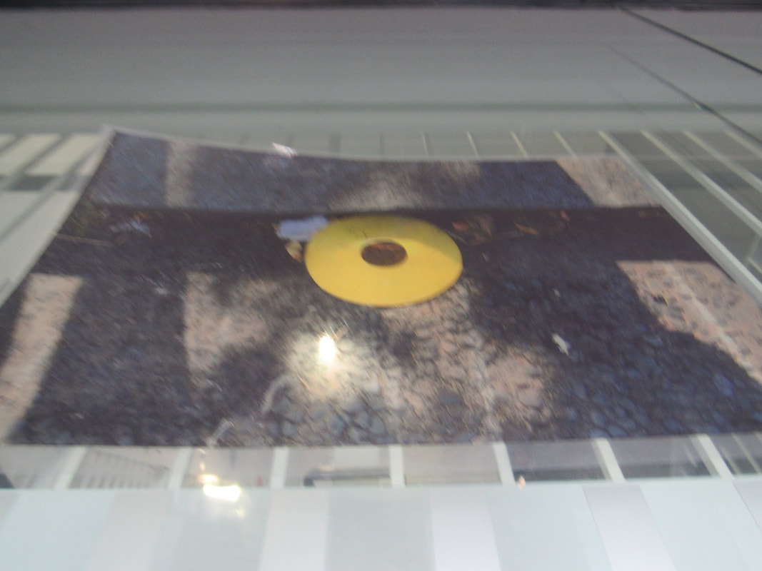
here are some pictures using paper and light from our phones. This is meant so show some shadows and make the edges stand out more. Two of the pictures have been photoshop which is sort of notice and that it the two bottom and the rest are raw.
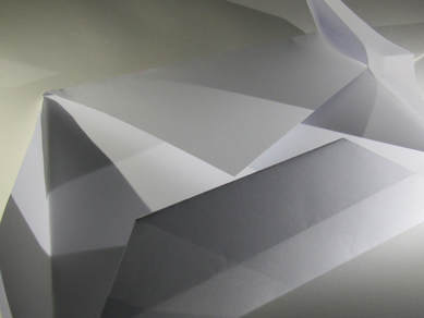
This one is my favourite because it looks like there more edges then there really is because of the light and because the way the shadows look like.
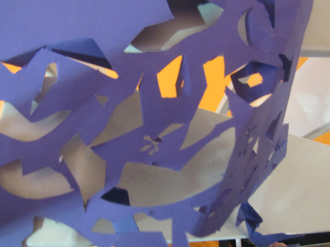
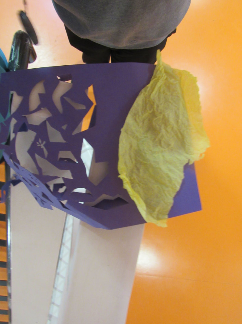
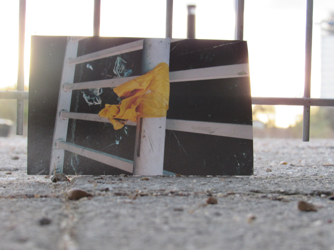
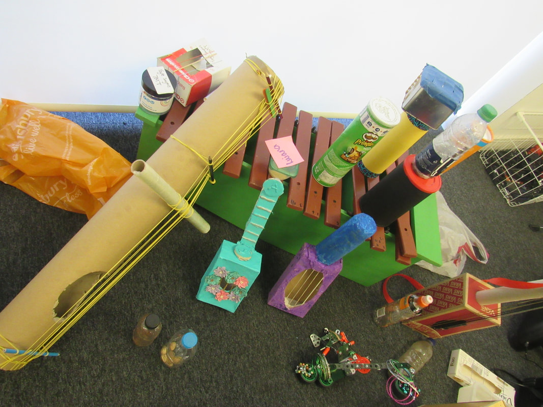
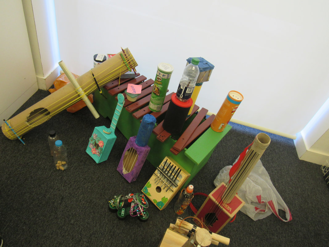
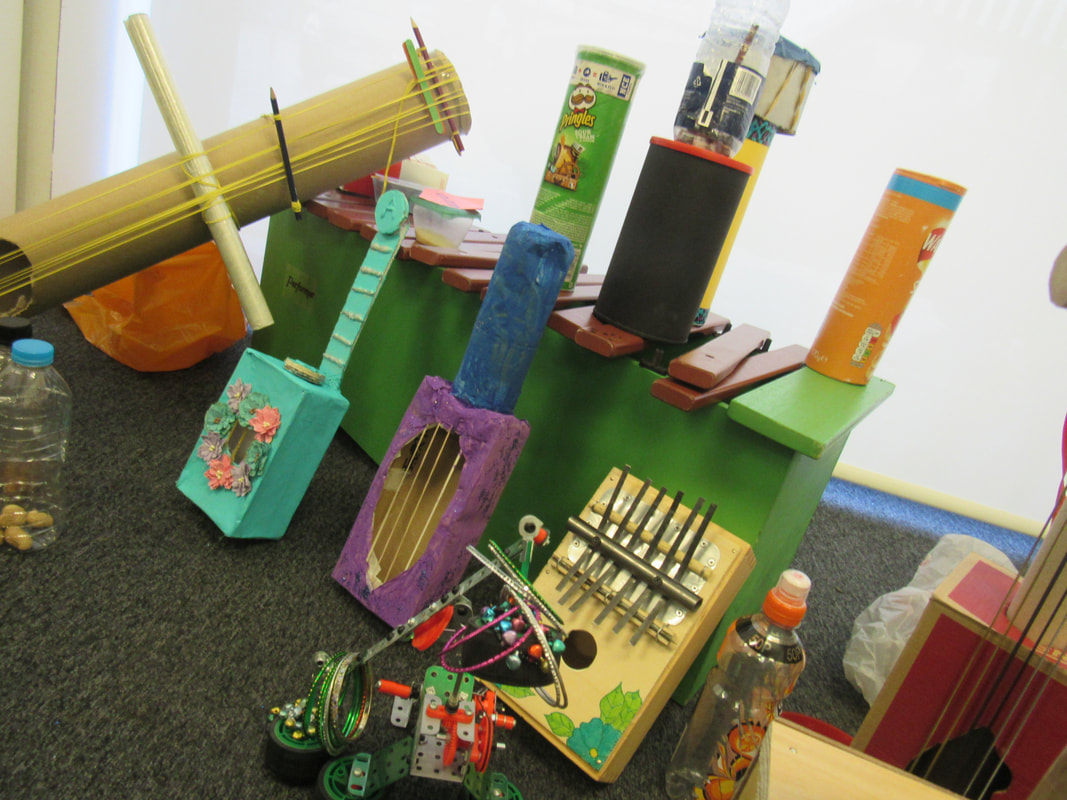
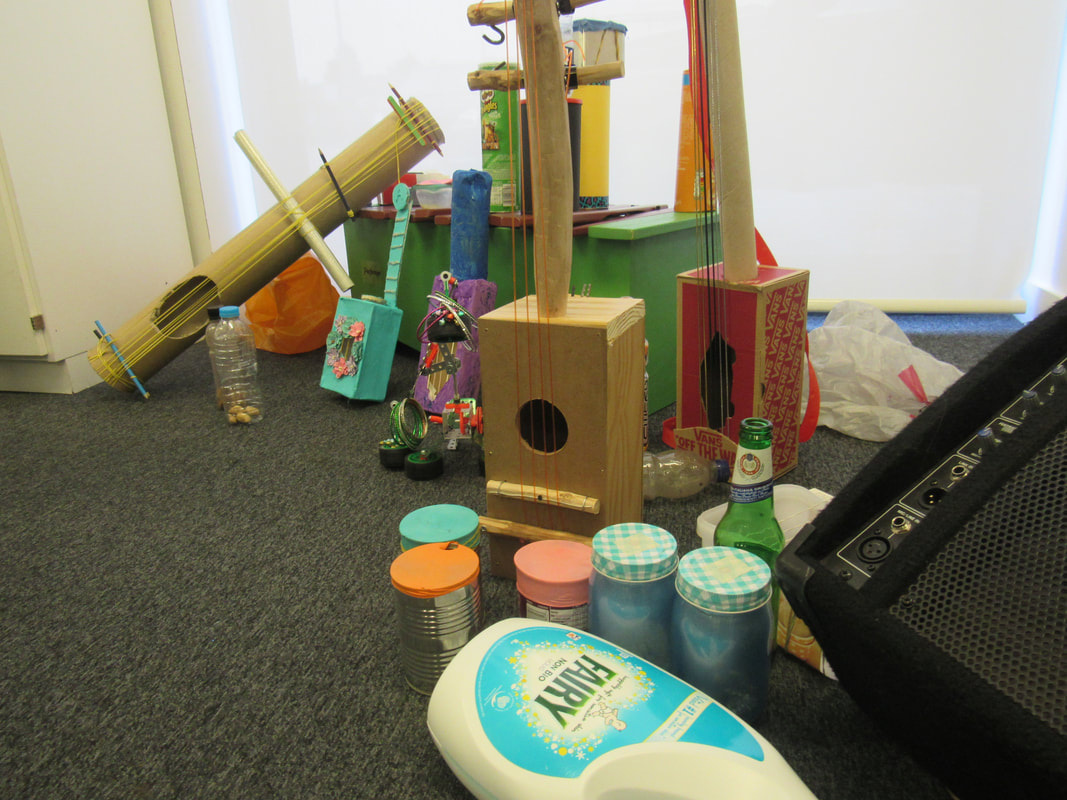
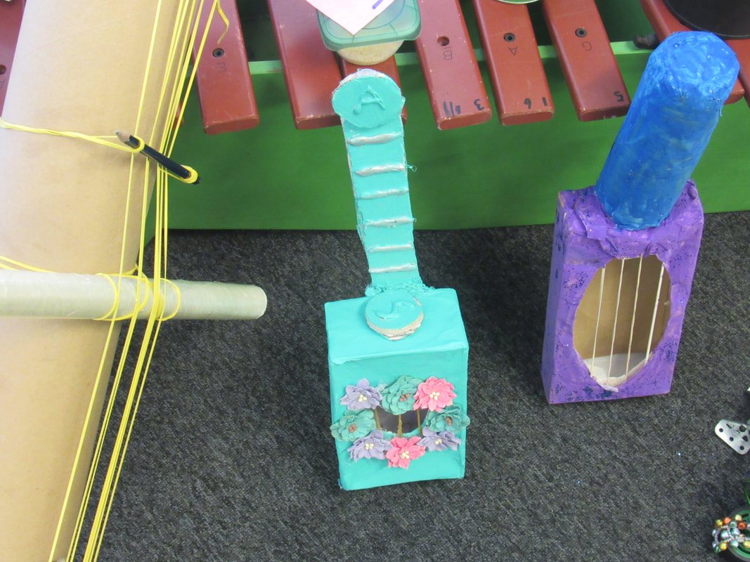
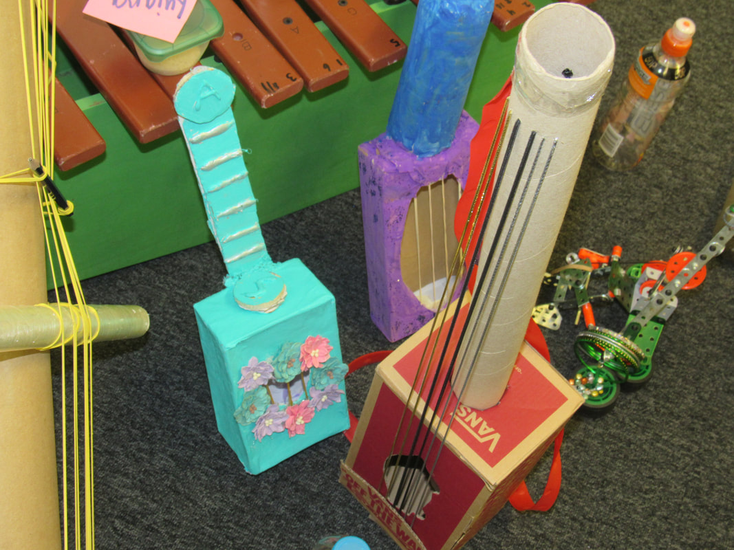
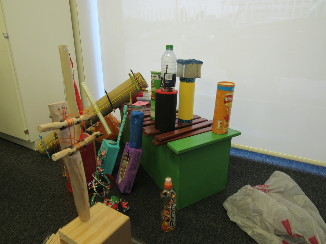
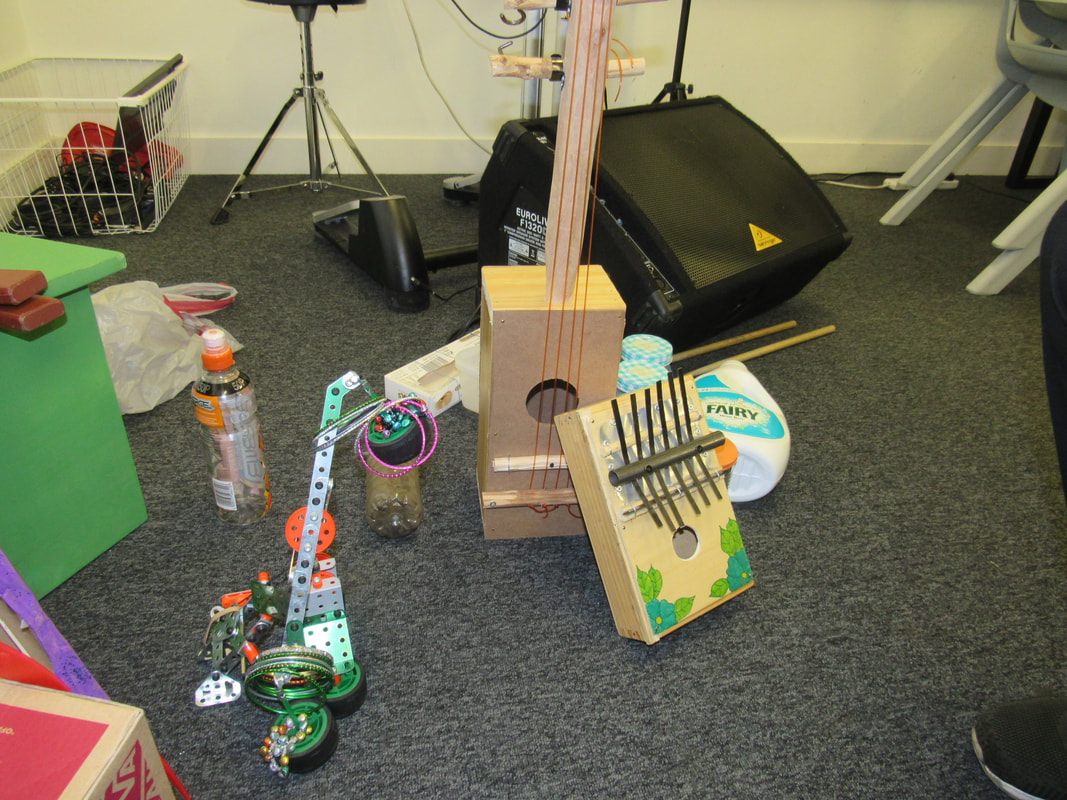
This is a behind the scenes of taking the pictures and the objects that we use. It's really fun making the objects and taking pictures of them in different angles. We have to think of what is is gonna look like when we take the picture and the lighting of them and find the perfect spot for them and thats hard due to the fact that is can be windy and the paper can blow away so thats why getting a good lighting for the picture is a bit hard.
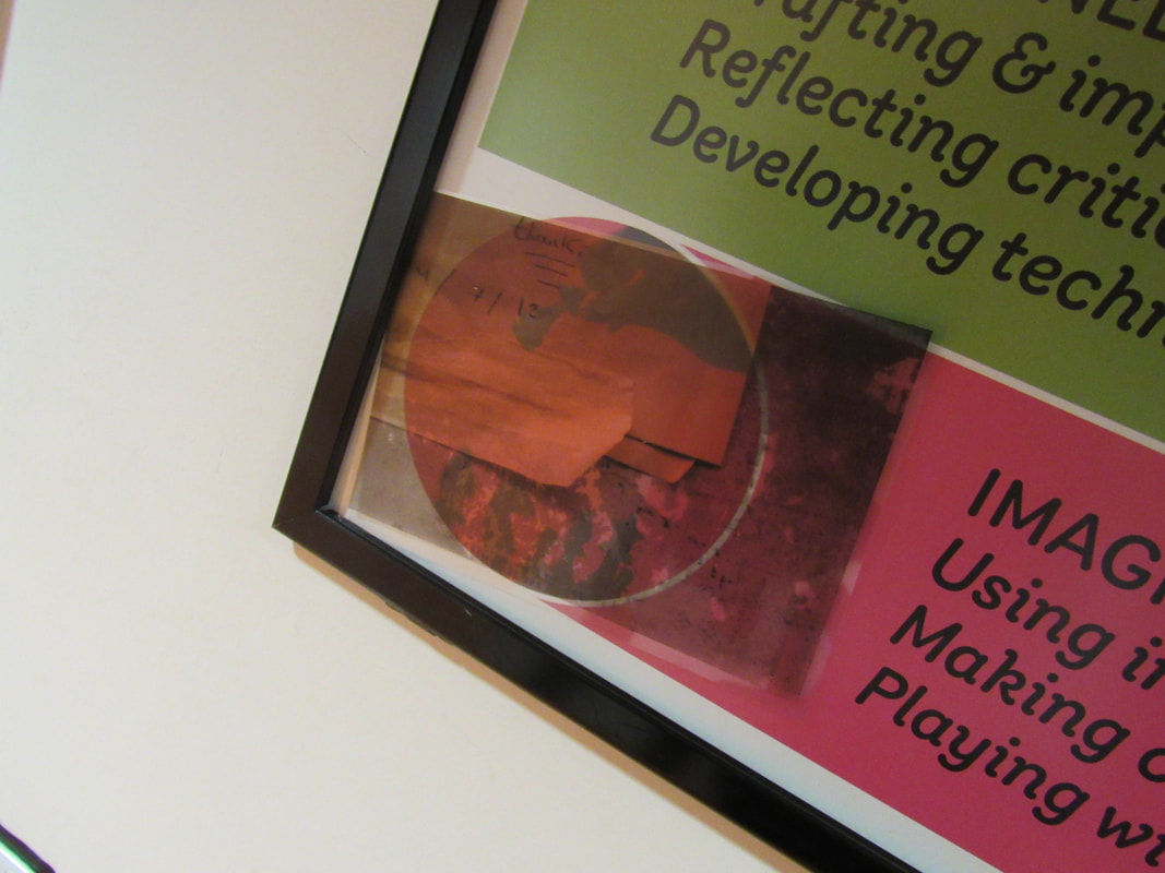
edges assessment
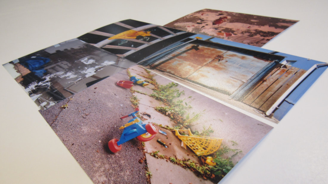
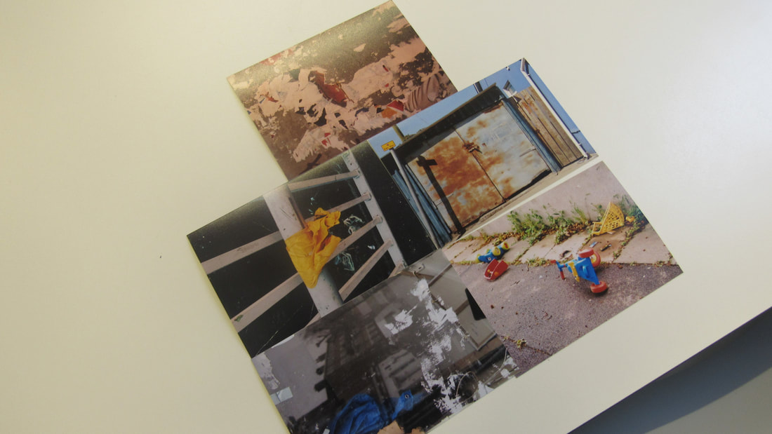
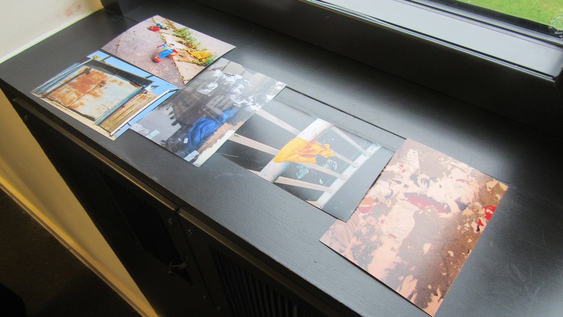
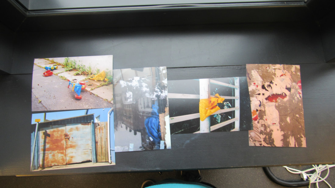
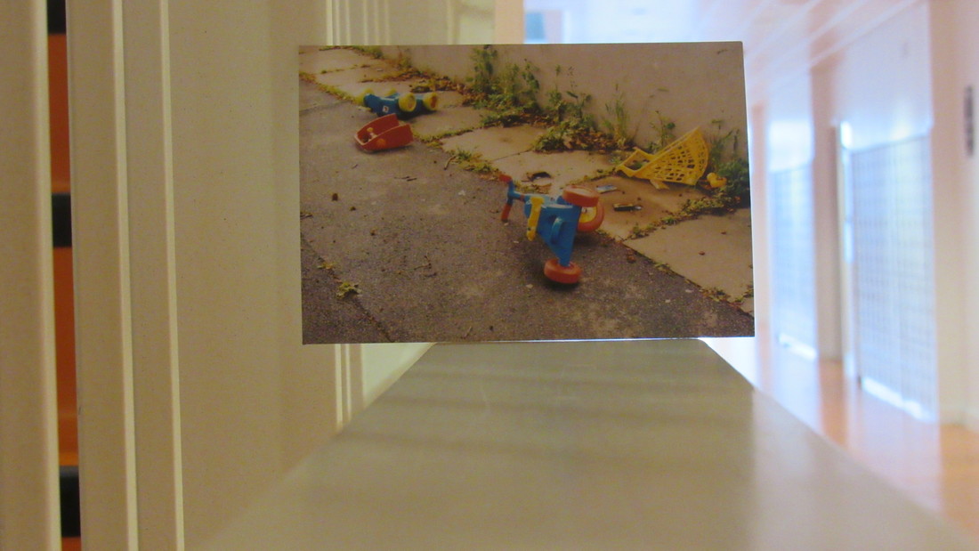
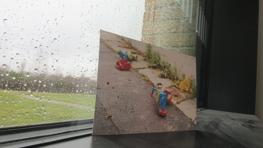
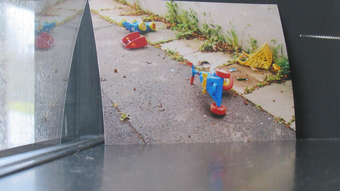
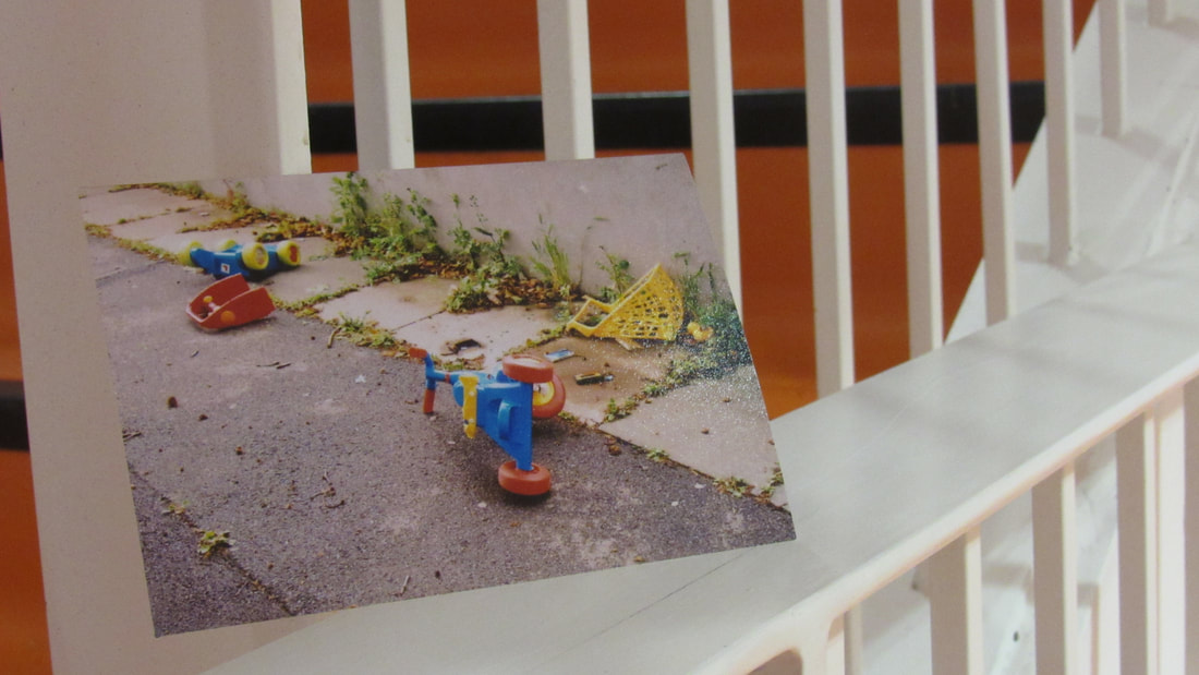
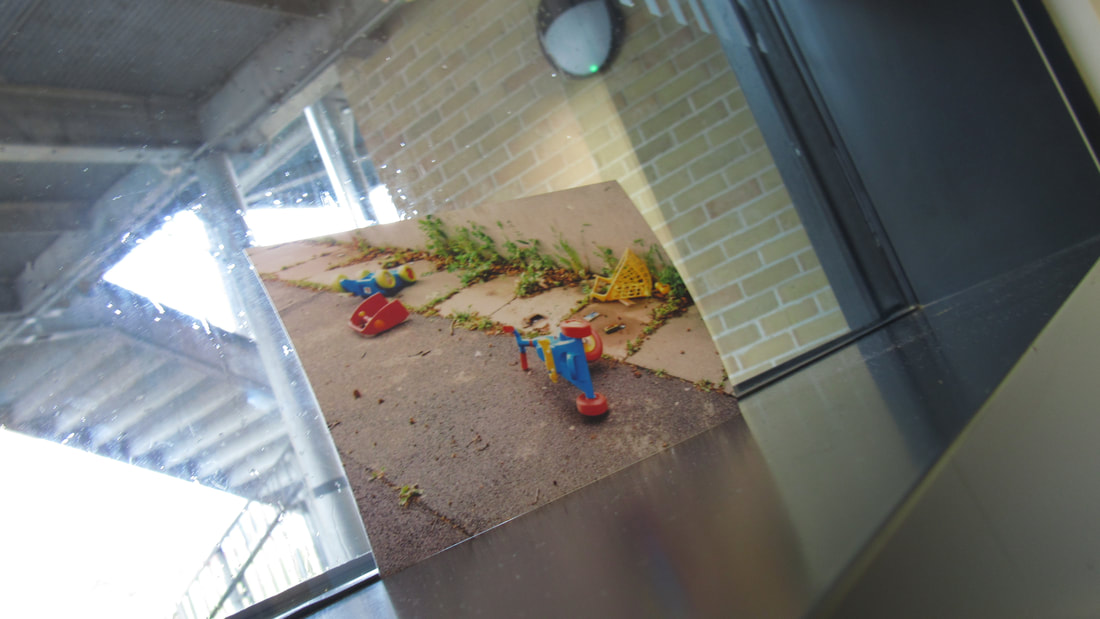
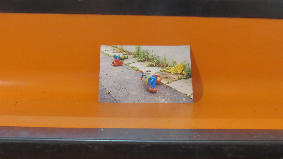
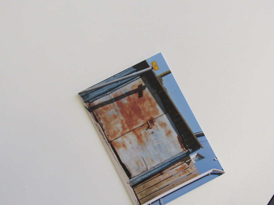
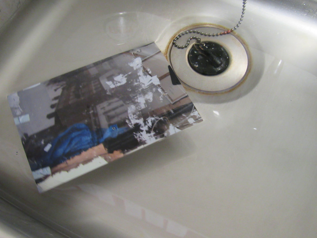
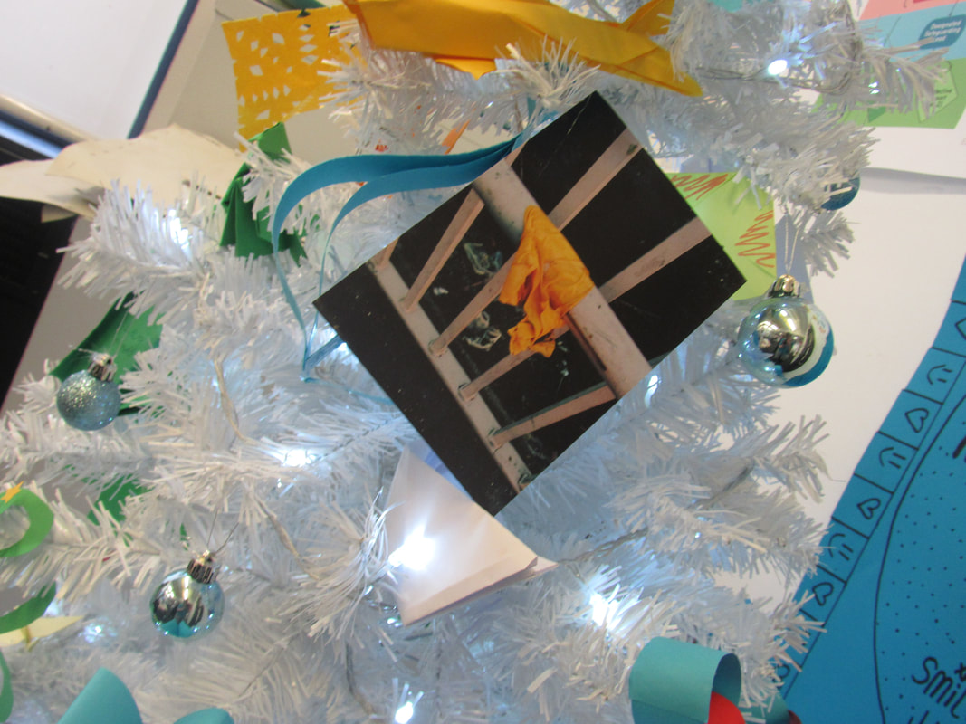
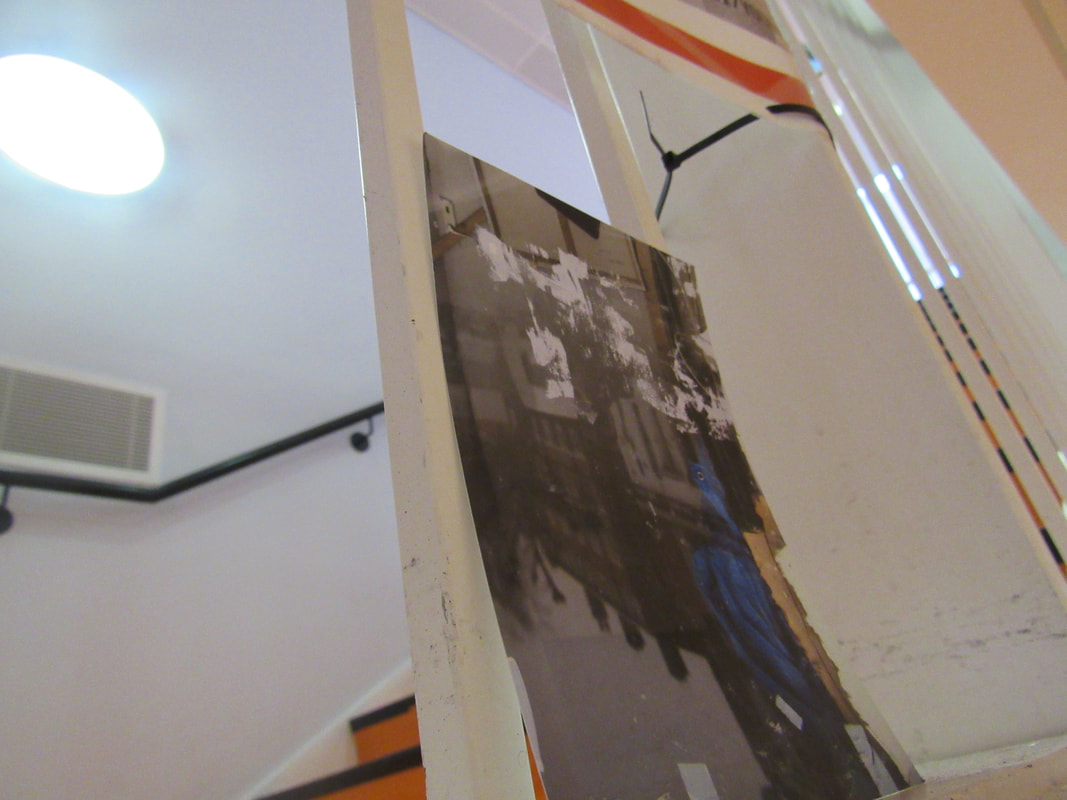
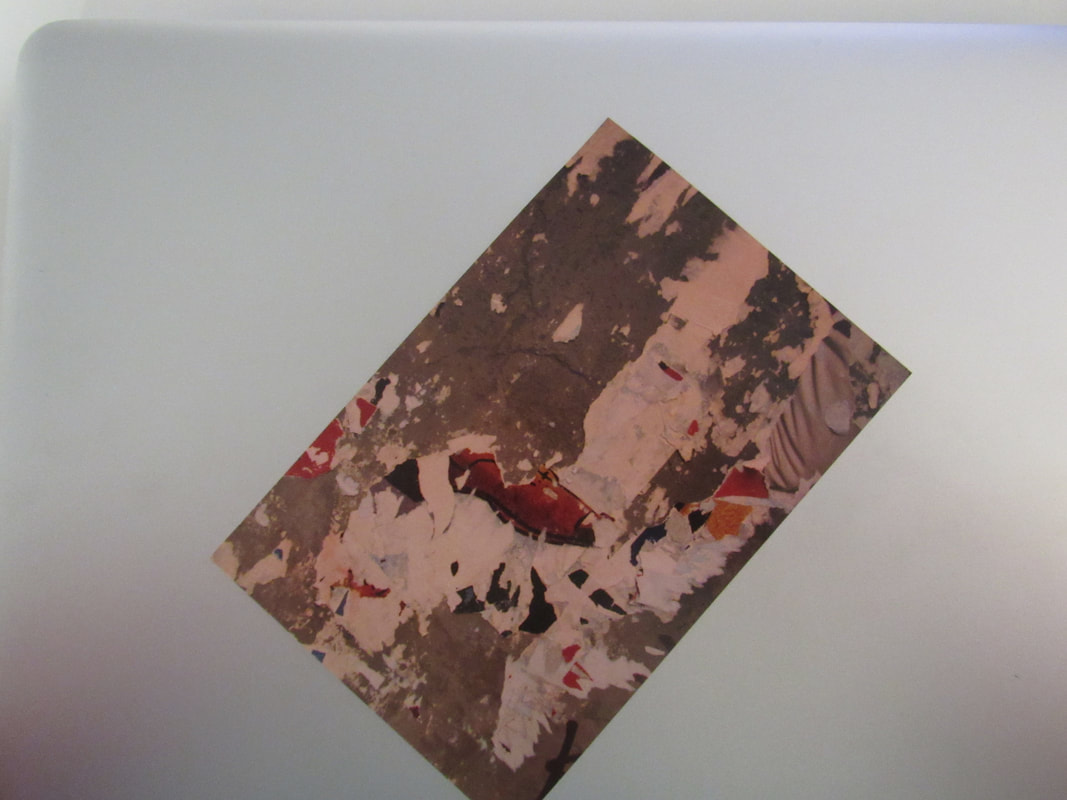
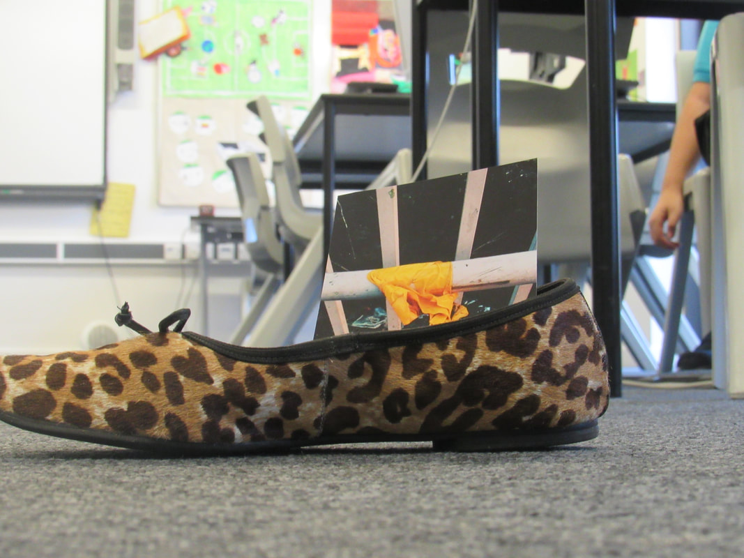
I have chosen these 5 pictures because all the pictures look like old pictures and that all of the stuff in the pictures look abandoned by the owners and that look like was a story behind the pictures and thats what made me choses them.


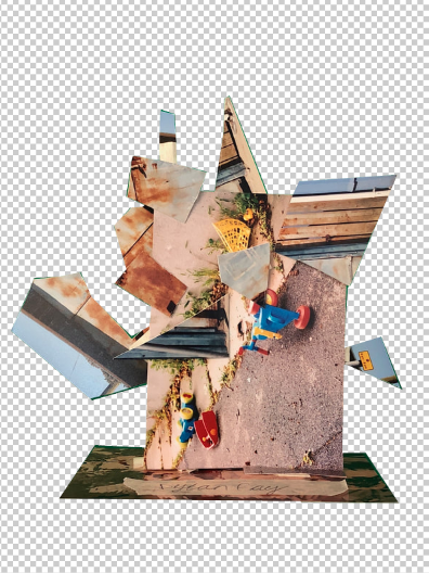
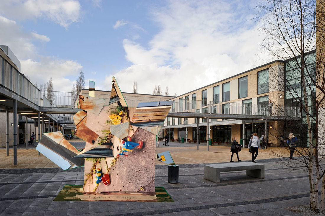
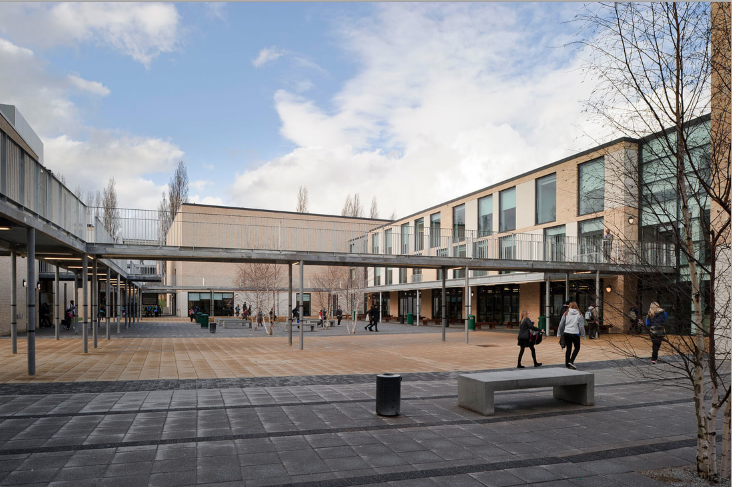
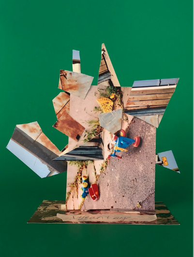
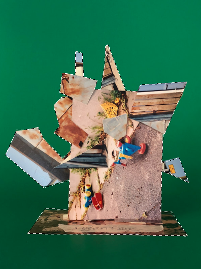
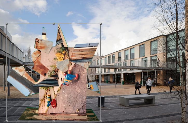
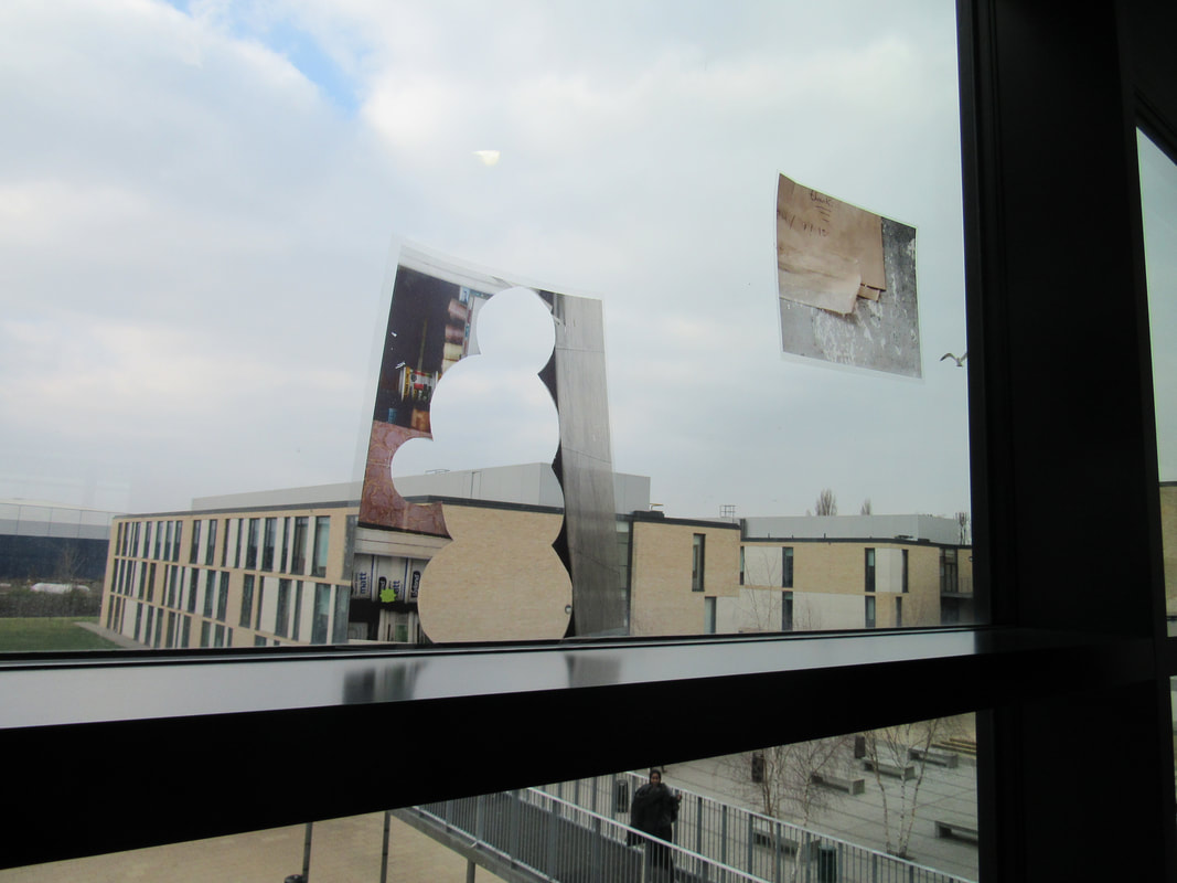
For a few lessons now we have been working on these pictures and last lesson we had to cut them into any shape and size and stick it on any picture of ours and over the holidays they was brought into a room that had a green screen and we had to go onto photoshop and make them look like they are in the our school.
These screen shots aren't in-order but you can probably understand what picture goes in what order.
These screen shots aren't in-order but you can probably understand what picture goes in what order.
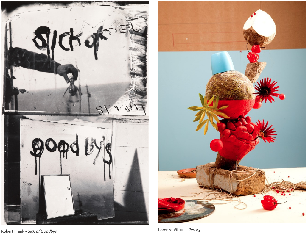
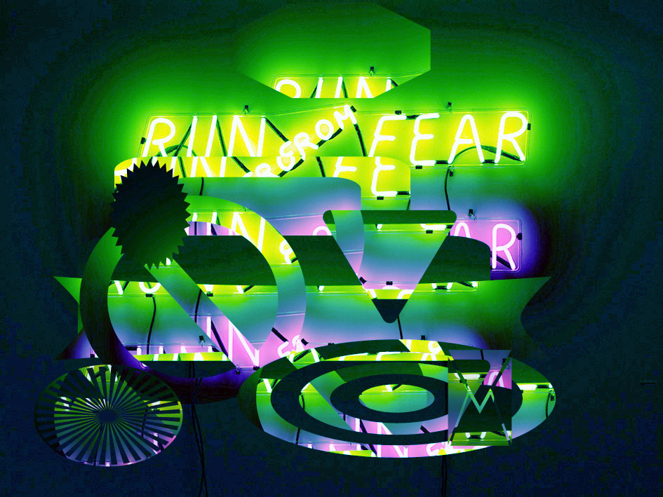
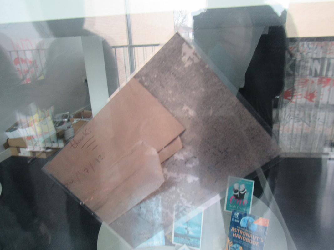
I think Frank’s photo and Vitturi’s photo is very artistic for example in Frank’s photo it is only made with a few items same with Vitturi’s. In Frank’s photo, it is made with mirrors and paint and there are no colours apart from black and white But in Vitturi’s photo it is made of al lot of thing like cups, flowers and string with warm colours like red, orange and brown with one cool colour which is blue. In Frank’s photo, it is actually two pictures that are combined in to one picture. You don’t really notice it at first glance but looking at it after a few seconds you can see the line that combines them together. The thing that surprises me are how many objects there are to make a cool looking photo. In Frank’s photo there are 2 objects that make the whole picture but in Vitturi's photo there are a few more objects then Frank's but not by much.
Comering the two pictures there are a few similarities and lots of differences between them two. I am going to start with the differences as there are way more and easier then the similarities. The first and most obvious is the colours, there is a huge colour difference between them two. In Frank's picture the mains colours are black and white but in Vitturi's there are colours like red, orange, browns, white and blue. The second difference is the objects that are used in the pictures, in Vitturi's he uses string, cup and flowers whilst Frank used a few mirrors and paint. the fire difference is the mark on Frank's picture, if you look very closely you can see a mark of the year on the picture but its backward and on Vitturi's there is no mark on the picture. Now for the similarities. I can't really see that many similarities but I have 2. The first similarity is a complex characteristics and they are difficult to replicate or to describe. the second similarity is the same shape of format. The thing that amazes me in both picture starting with Vitturi's. In Vitturi's picture that amazes me is how he has got all them things balanced in one tower now with Frank's. The thing that amazes me with Frank's picture is the fact that it is only black and white what I thing looks really nice.

----------------------------------------------------------------------------------------------------------------------------------------------------------------
WHAT WE DID.
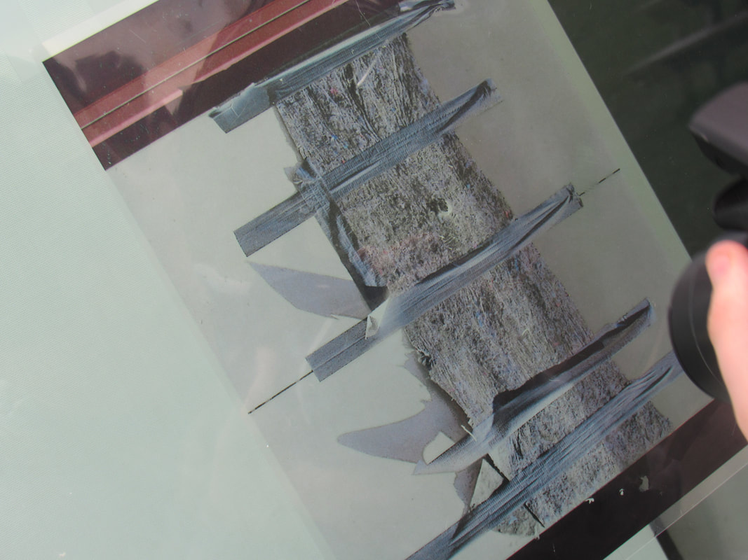
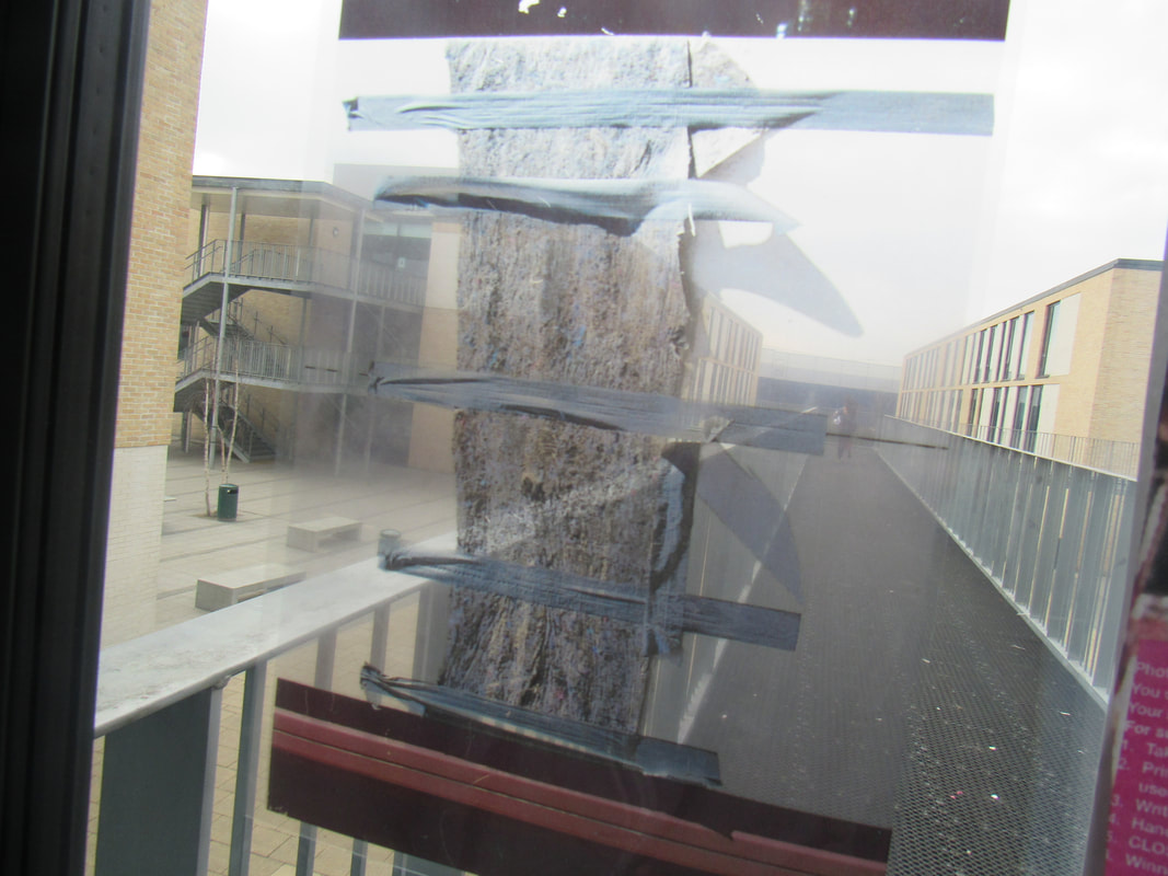
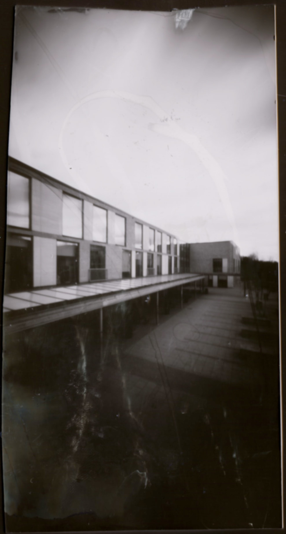
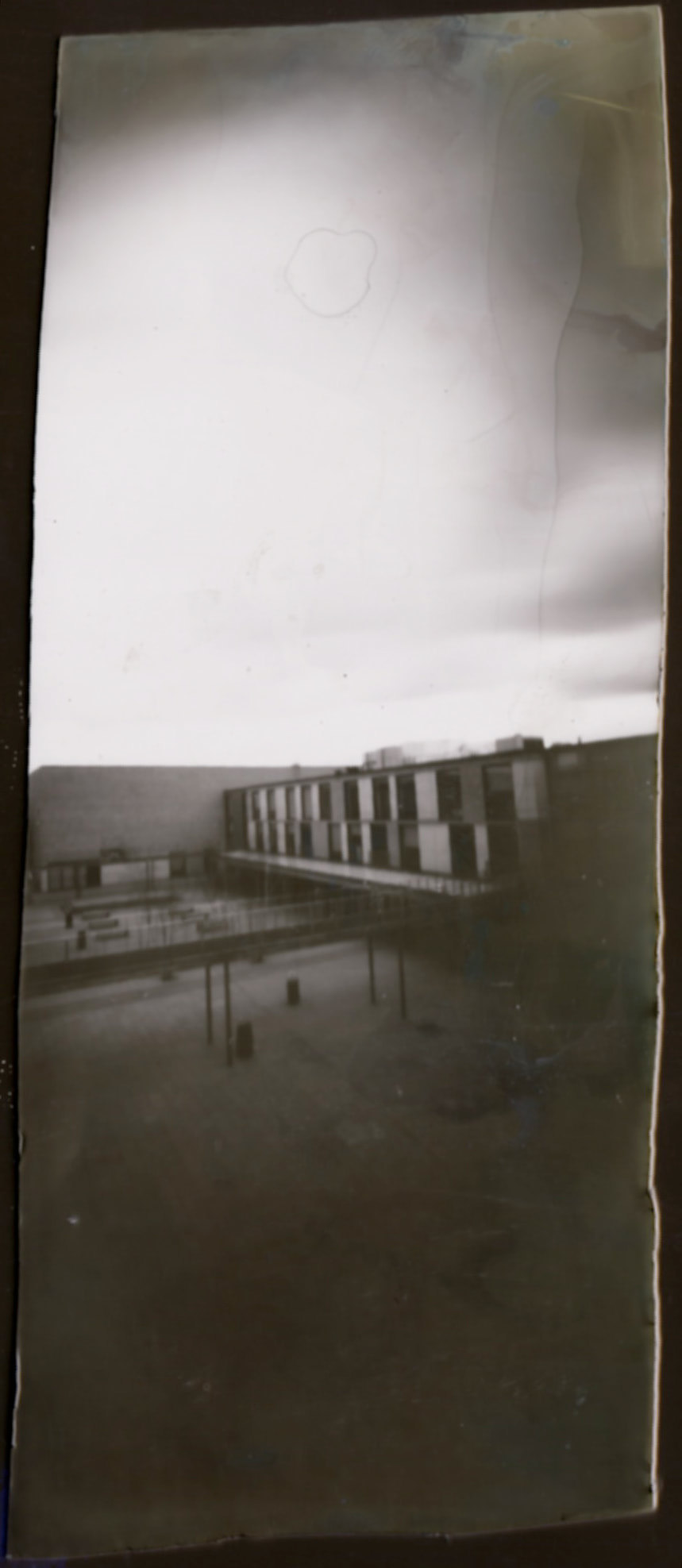
we got our pin hole cameras and went into the dark room and cut some paper that is light sensitive and went around the school. There are more pictures but I think these are the best ones so I choses them.
we got our pin hole cameras and went into the dark room and cut some paper that is light sensitive and went around the school. There are more pictures but I think these are the best ones so I choses them.
